Sir Terry Frost
(British, 1915-2003)
Red, blue and white
1966
oil on canvas
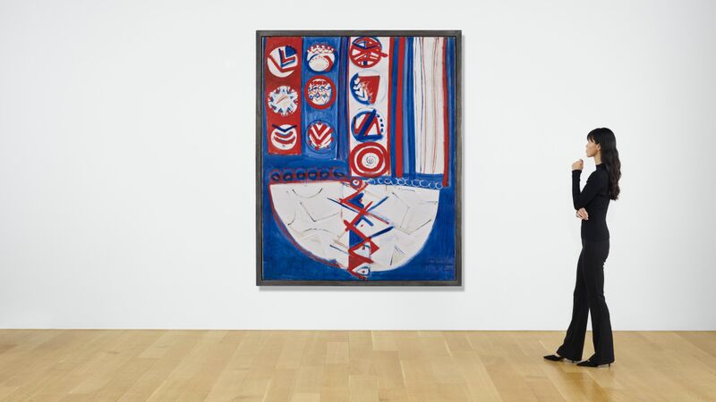
218.5 x 173.2 cm (86 x 68⅛ in.)
signed, dated and titled 'Frost. April - Sept 66 Red Blue White.' (on the canvas overlap)
Paisnel Gallery, London
Private collection (purchased from the above in 2004)
C. Stephens, Terry Frost, London, 2000, pp. 55 & 57, fig. 41
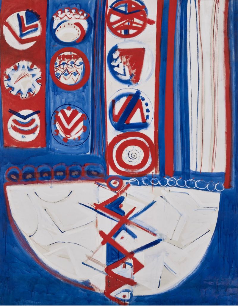
Red, blue and white (1966) is an outstanding example of Terry Frost’s work from the mid-1960s. Frost had his first solo show in New York at Bertha Schaefer Gallery in 1960, he then moved away from St Ives to Banbury in 1963, and by 1965 he became a full-time lecturer at the Department of Fine Art at Reading University. While these events may suggest a state of flux in the artist’s life, in reality the ‘60s served as a stable, new chapter in Frost’s influences and consolidation of iconography, which can clearly be seen in Red, blue and white.
During the ‘60s, Frost was keen to find a ‘structural continuity’ or a body of work that consistently employed a personalised vocabulary of signs. This began at the start of the decade with Three Graces (1960) (fig. 1), which is an abstract translation of Ruben’s The Judgement of Paris (1636). While this might seem like a rather bizarre and unlikely influence, in fact, Frost was actually an avid visitor of the National Gallery and it was here that he closely scrutinised Old Masters in an attempt to create his own ‘structural continuity’ within his artistic canon.
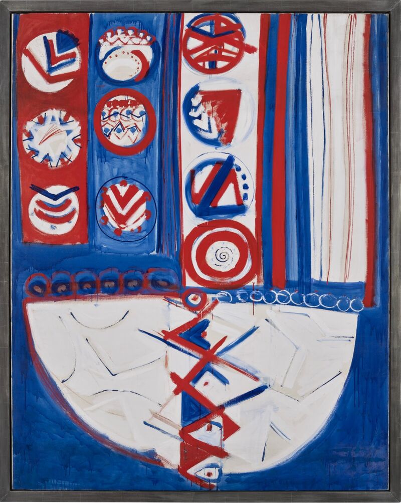
Red, blue and white aside from its use of the semi-circle, which was already a developed and prominent motif within Frost’s work, stands as testament to the artist’s new iconographical language of the ‘60s. Moreover, within Red, blue and white, the decorations of each block of colour are dominated by chevrons and roundels, which are painted in the same colours as the title. This visual language derived from his move to Banbury in 1963, which allowed Frost to easily visit Compton Wynyates, the Marquis of Northampton’s country house, where he was shown the flags carried into the 1642 Battle of Edge Hill. These standards were covered with black chevrons and blue circles, which came to directly influence the decorative aspects of Red, blue and white and Frost’s earlier work - Standard Banbury (1965) (fig. 2). Frost contemporises these signs within a 20th century context and this is supported by David Lewis who has stated that: ‘somehow the heraldic imagery inspired by the Compton Waynyates banner and the commanding brashness of road signs were brough together in new, harsher shapes and colours in the paintings of the early 1960s.’
Red, blue and white, as the name suggests, also underscores Frost’s fascination with colour during the decade. The work is divided into sections, which are surrounded by a vivid and darker blue background, reminiscent of the artist’s earlier abstract seascapes of Cornwall in the 1950s. These juxtapositions of colour also provide a dynamism to the work, magnifying the tension that derives from the speedily executed boundaries between the contrasting forms. Red, blue and white is a fine example of Frost’s consolidation of personalised visual signs, but it also serves as a clear-cut example of the artist’s influences, making it a unique and special work for any collector.
Price:
£40,000
More artworks by Sir Terry Frost ▶
You may also like:
Enquire Now
Fill in the form below and we will respond as soon as possible.
Make an offer
Fill in the form below and we will respond as soon as possible.


